La Tulipana is a London-based florist with its own character. I worked with Anita on two fronts: brand identity — logo, branding, ASCII art and social media content — and the website for the Mother's Day collection. My contribution starts from the concept: the tension between digital and artisanal as the thread running through the entire brand.
La Tulipana es una floristería con base en Londres y un carácter propio. Trabajé con Anita en dos frentes: la identidad de marca — logo, branding, ASCII art y contenido para RRSS — y la web para la colección del Día de la Madre. Mi contribución parte del concepto: la tensión entre lo digital y lo artesanal como hilo conductor de toda la marca.
01 — Branding
& ASCII Art
The identity is born from the calligraphic gesture — a line with intention and rhythm, the visual translation of human writing: imperfect, fluid, emotional. Script lettering allows playing with the stroke, intertwining forms, extending ligatures, and creating compositions where the drawing of the word matters as much as its reading. The logotype was built with a 0.5mm oval brush — when a brand is born from hand calligraphy, it connects directly with the artisanal, the sensitive, the bespoke.
La identidad nace del gesto caligráfico — una línea con intención y ritmo, la traducción visual de la escritura humana: imperfecta, fluida, emocional. El lettering script permite jugar con el trazo, entrelazar formas, extender ligaduras y crear composiciones donde el dibujo de la palabra importa tanto como su lectura. El logotipo se construyó con pincel ovalado de 0,5mm — cuando una marca nace de la caligrafía manual, conecta directamente con lo artesanal, lo sensible, lo hecho a medida.


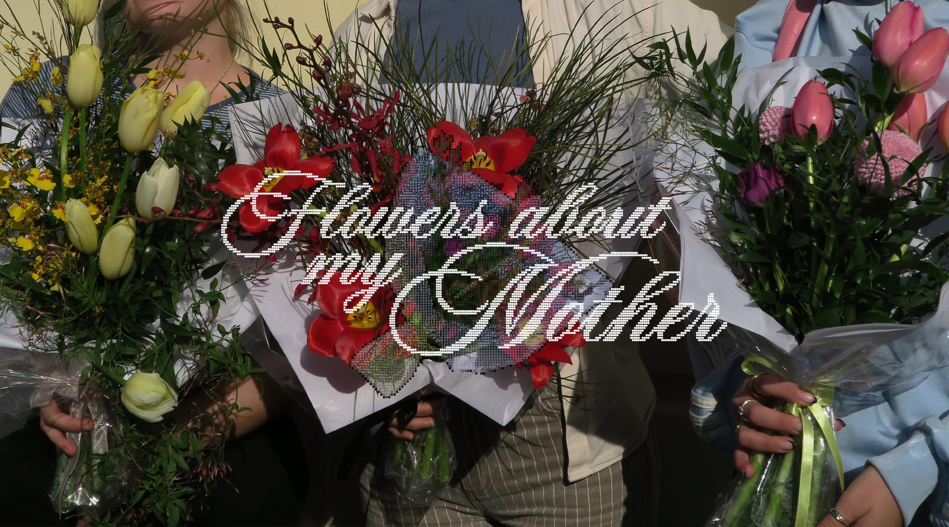
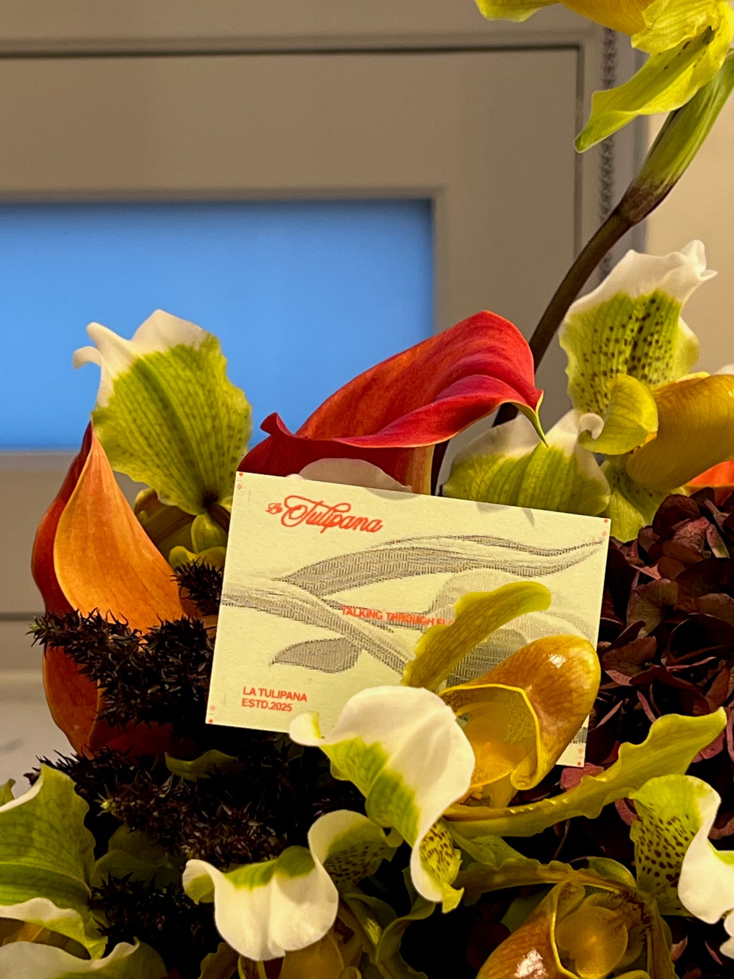
I proposed ASCII art as the visual system — it comes from the earliest digital languages, when images were built with text and code was aesthetic material. We developed a custom typeface with illustrated characters and an image-to-ASCII converter. Each character works as a flower, each image is reinterpreted as a pattern of symbols — code as garden.
Propuse el ASCII art como sistema visual — viene de los primeros lenguajes digitales, cuando las imágenes se construían con texto y el código era materia estética. Desarrollamos una tipografía propia con caracteres ilustrados y un convertidor de imágenes a ASCII art. Cada carácter funciona como una flor, cada imagen se reinterpreta como un patrón de símbolos — código como jardín.
 DRAG
DRAG

I worked on the pixelation logic of the logotype — the artisanal calligraphy reinterpreted in digital terms. The sensitive brought into the realm of code and visual subcultures: from gesture to glitch, from romanticism to pixel, without losing its soul.
Trabajé la lógica de pixelación del logotipo — la caligrafía artesanal reinterpretada en clave digital. Lo sensible llevado al terreno del código y las subculturas visuales: del gesto al glitch, del romanticismo al píxel, sin perder su alma.
Coral Red sits between red and warm pink — energy and vitality with a softness that distances it from the aggressive. A red that smiles, that conveys closeness. It connects with the floral without resorting to the obvious. The rosy cream acts as a soft canvas where the coral breathes — calm, balance, the tactile feel of artisan paper. One brings energy, the other offers space.
El Rojo Coral se sitúa entre el rojo y el rosa cálido — energía y vitalidad con una suavidad que lo aleja de lo agresivo. Un rojo que sonríe, que transmite cercanía. Conecta con lo floral sin recurrir a lo obvio. El crema rosado actúa como lienzo suave donde el coral respira — calma, equilibrio, sensación táctil de papel artesanal. Uno aporta energía, el otro ofrece espacio.
Visual content for social media that translates the brand into digital format. Business cards with ASCII art, A5 cards, and social media applications. Each piece explores the tension between the organic of the calligraphic script and the digital of pixel art and ASCII — two worlds that complement each other in La Tulipana.
Contenido visual para redes que traduce la marca al formato digital. Tarjetas de visita con ASCII art, tarjetones A5 y aplicaciones para social media. Cada pieza explora la tensión entre lo orgánico del script caligráfico y lo digital del pixel art y el ASCII — dos mundos que en La Tulipana se complementan.

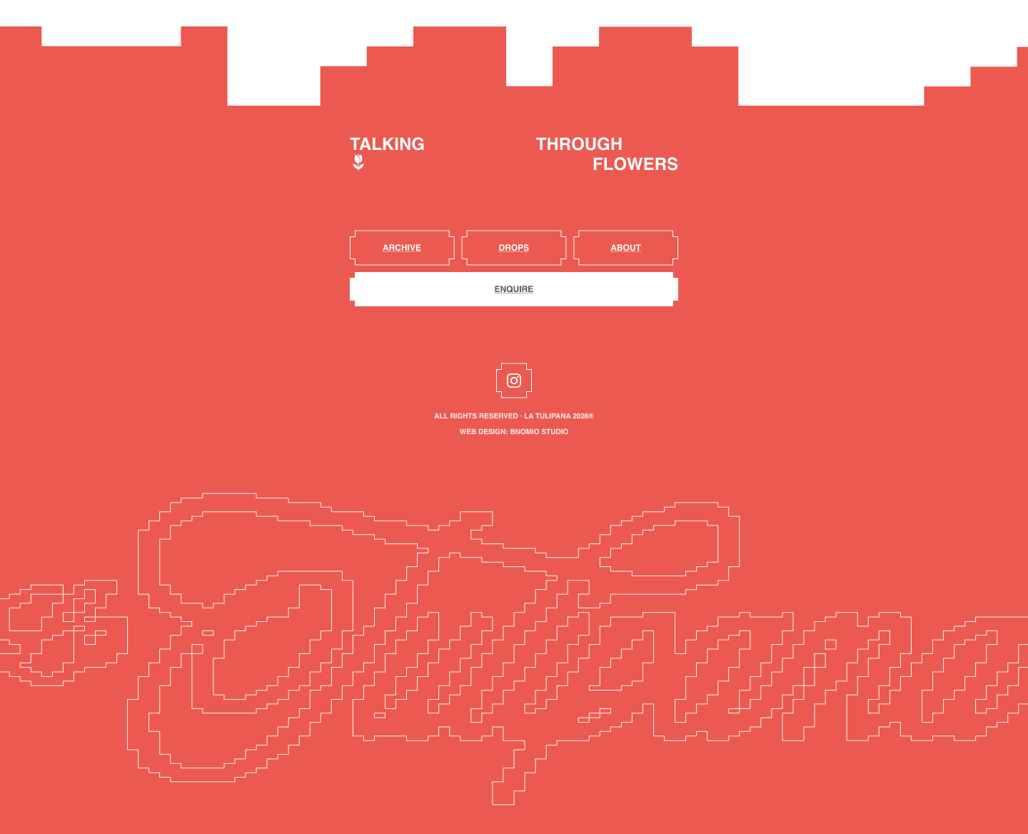
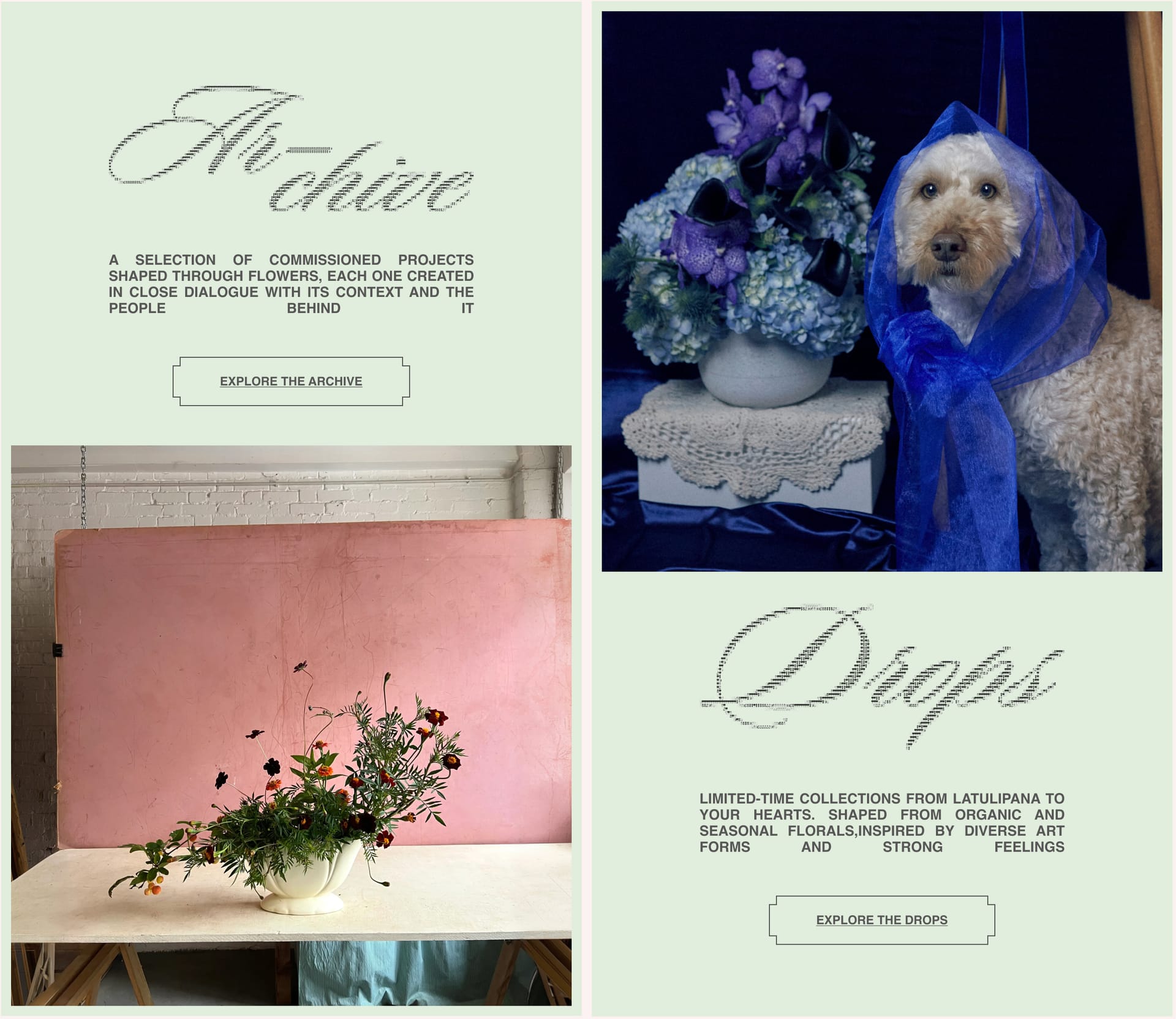
02 — Web
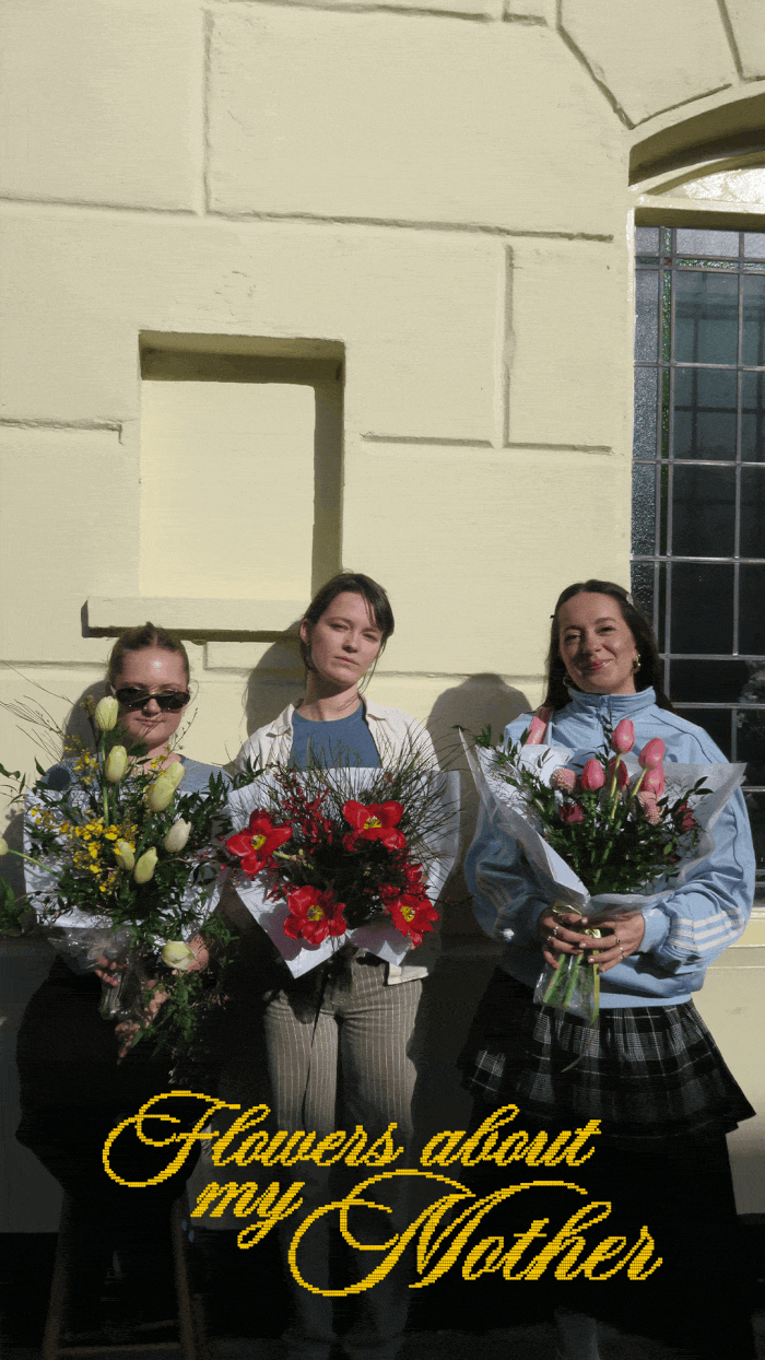
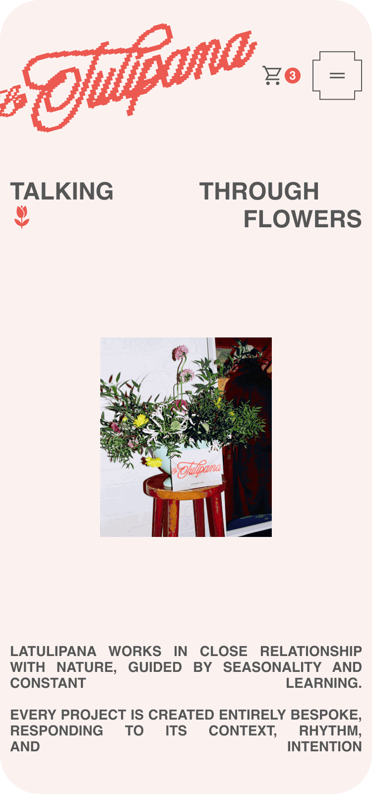
The second part of the project: the website. I worked on the management and production of content for the Mother's Day collection. The challenge was bringing the brand's artisanal personality into a digital environment that would work as a sales tool without losing its visual character.
La segunda parte del proyecto: la web. Trabajé en la gestión y producción de contenido para la colección del Día de la Madre. El reto era trasladar la personalidad artesanal de la marca a un entorno digital que funcionase como herramienta de venta sin perder el carácter visual.
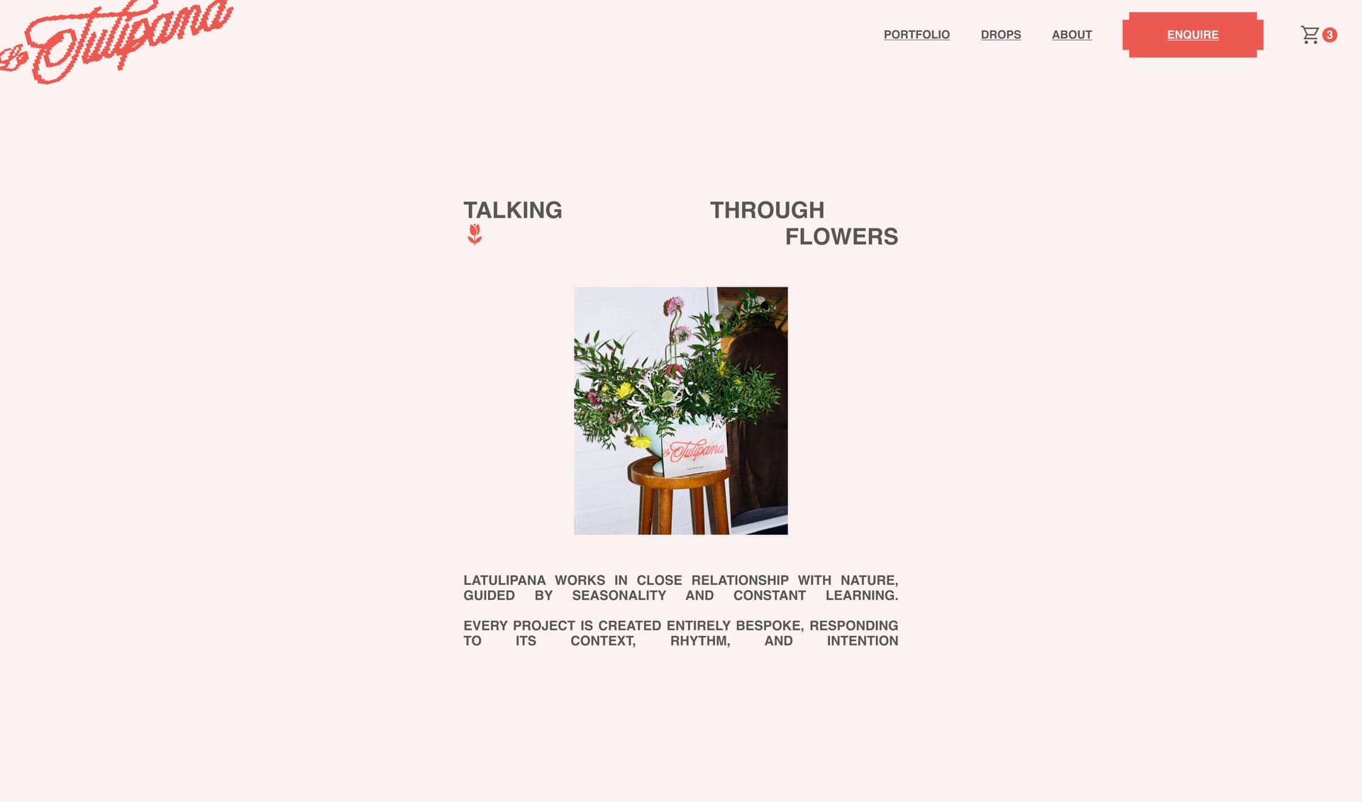
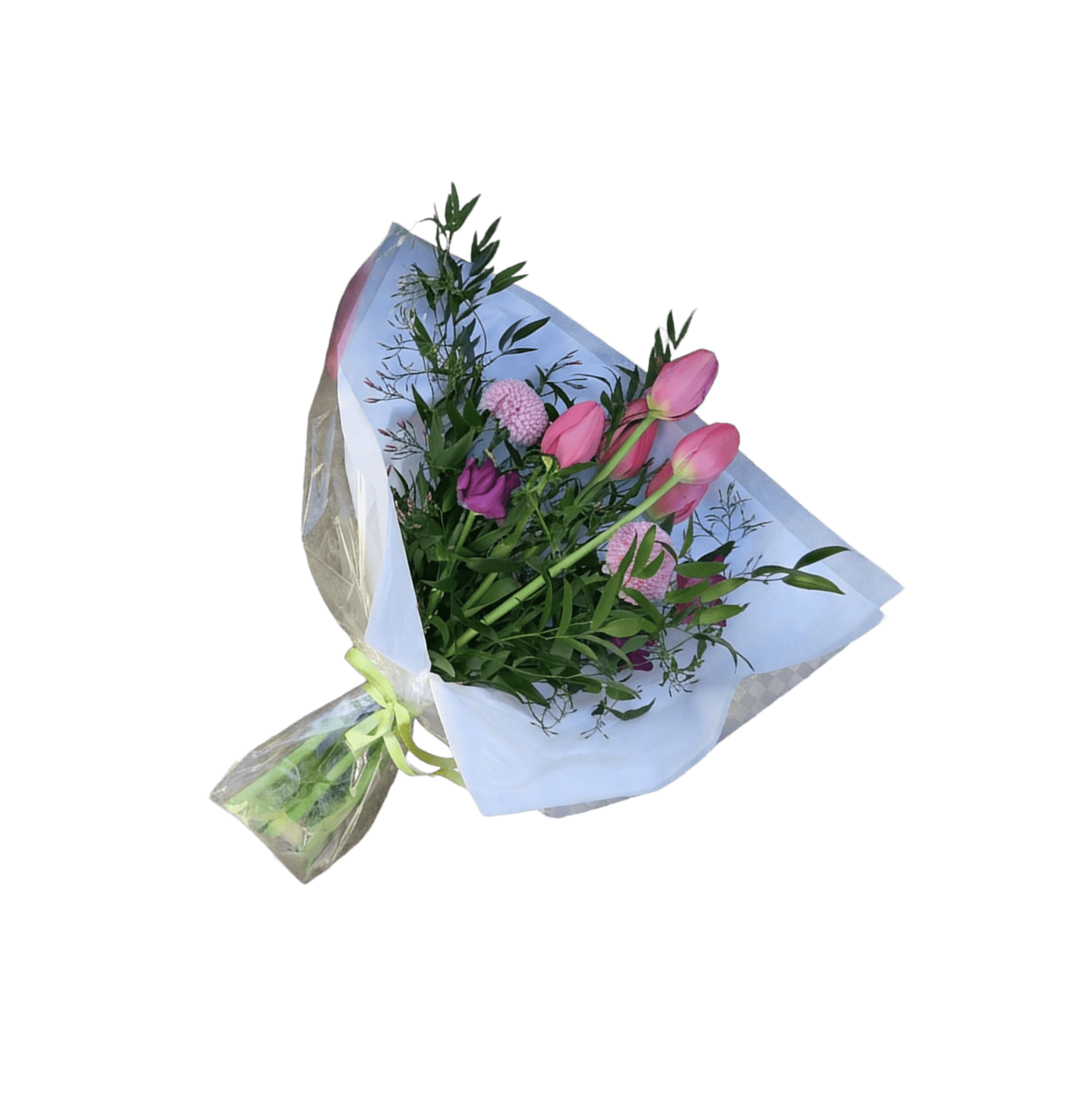
The website was built so each flower could speak for itself. Simplified navigation, product pages with careful photography, and a frictionless purchase flow. The visual system maintains the coral-cream palette from the identity and applies the script typeface at key moments to connect with the brand.
La web se construyó para que cada flor hablase por sí misma. Navegación simplificada, fichas de producto con fotografía cuidada y un flujo de compra sin fricción. El sistema visual mantiene la paleta coral-crema de la identidad y aplica la tipografía script en momentos clave para conectar con la marca.
-DldFWgsx.jpg)