VAMPS

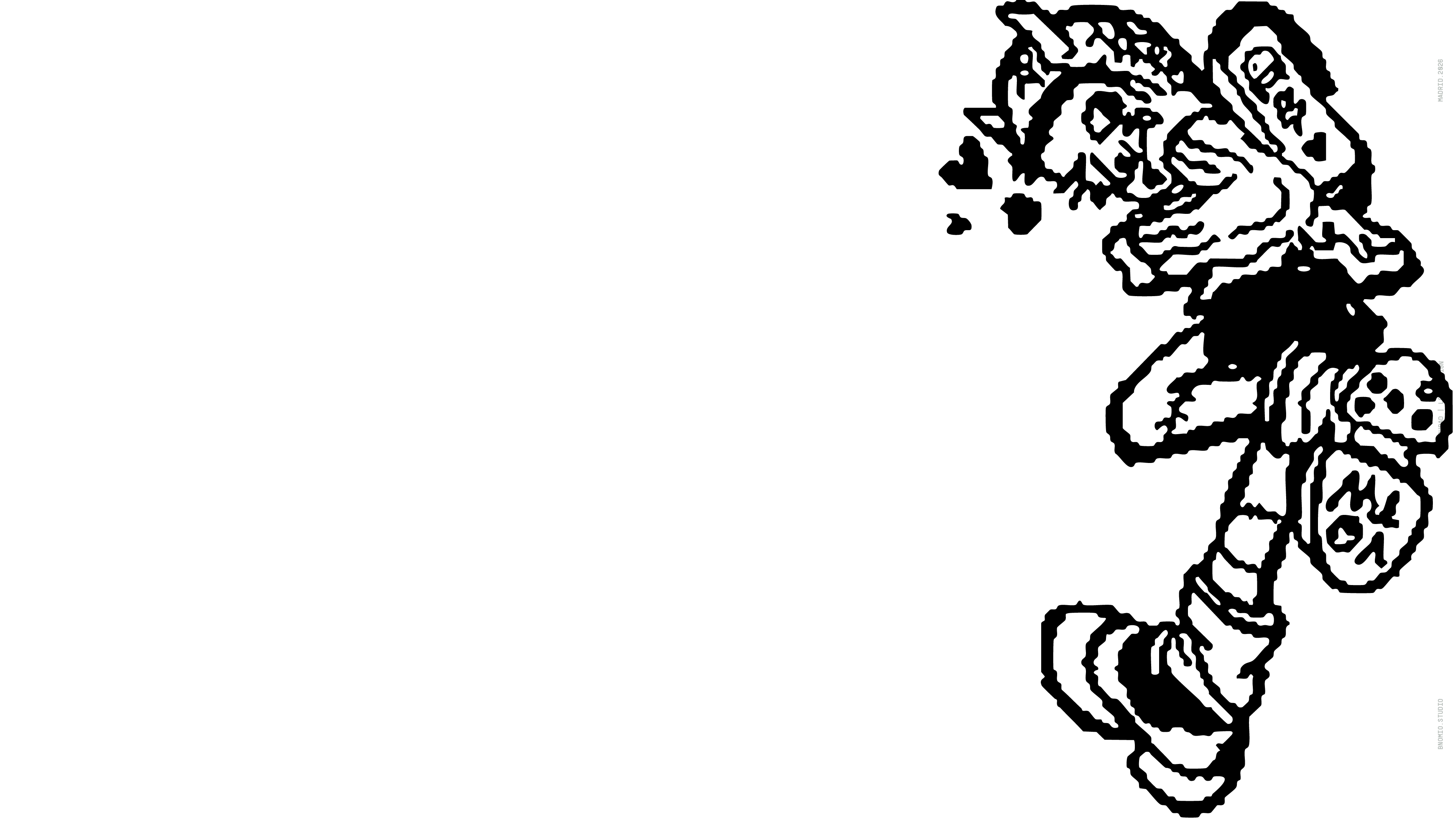
I don't quite remember when VAMPS started. One day I thought it'd be fun to riff on Vans, turning 'Vans of the world' into 'Vamps of the world', and from there it's been with me — on and off but constant. At first it was vampire doodles, 'vampirifications' of characters I like. The Vamps aren't about sucking blood or sleeping in coffins — they're cheeky characters, the development of a laid-back, affable, barely controllable personality.
No recuerdo bien cuándo empezó todo esto de VAMPS. Un día me hizo gracia hacer un guiño a Vans, convertir “Vans of the world” en “Vamps of the world”, y desde ahí me ha acompañado de forma intermitente pero constante. Al principio eran garabatos de vampiros, “vampirificaciones” de personajes que me gustan. Los Vamps no van de chupar sangre ni de dormir en tumbas — son personajes pillos, el desarrollo de un carácter desenfadado, afable y difícilmente controlable.
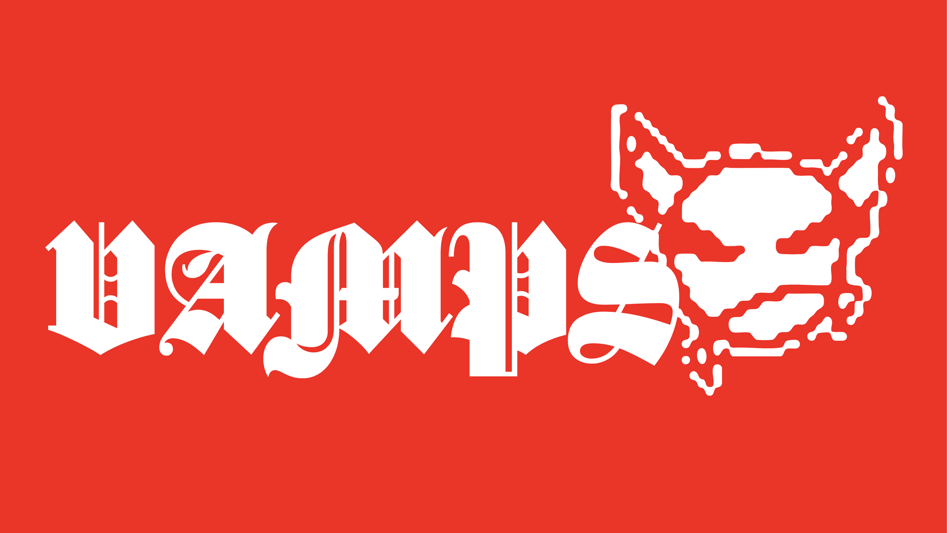
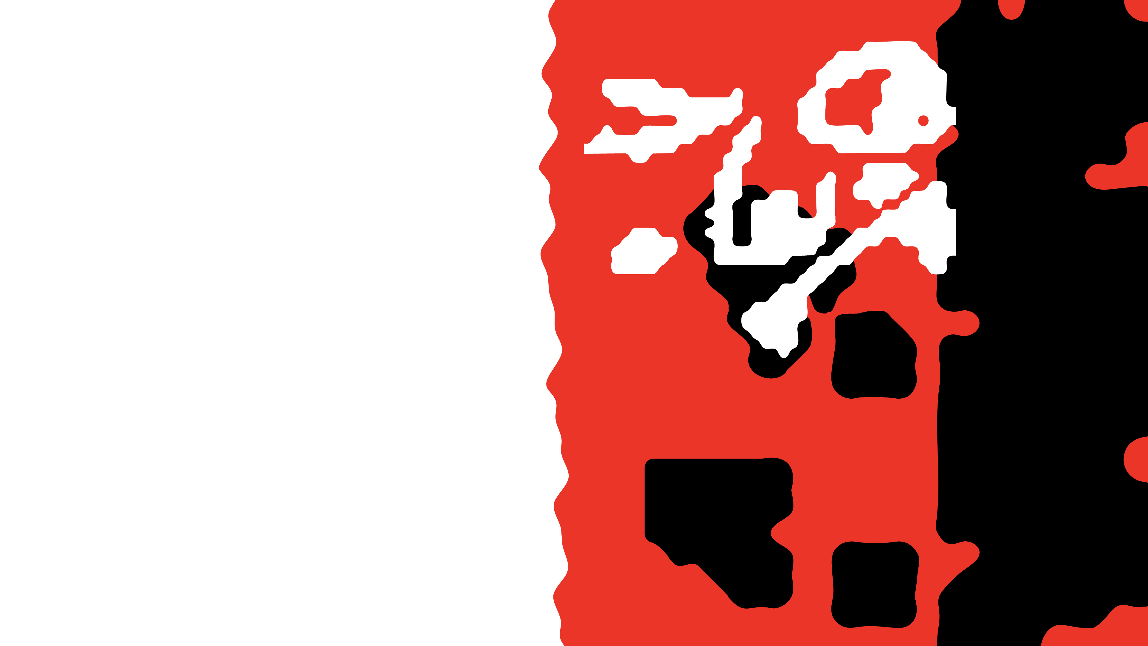
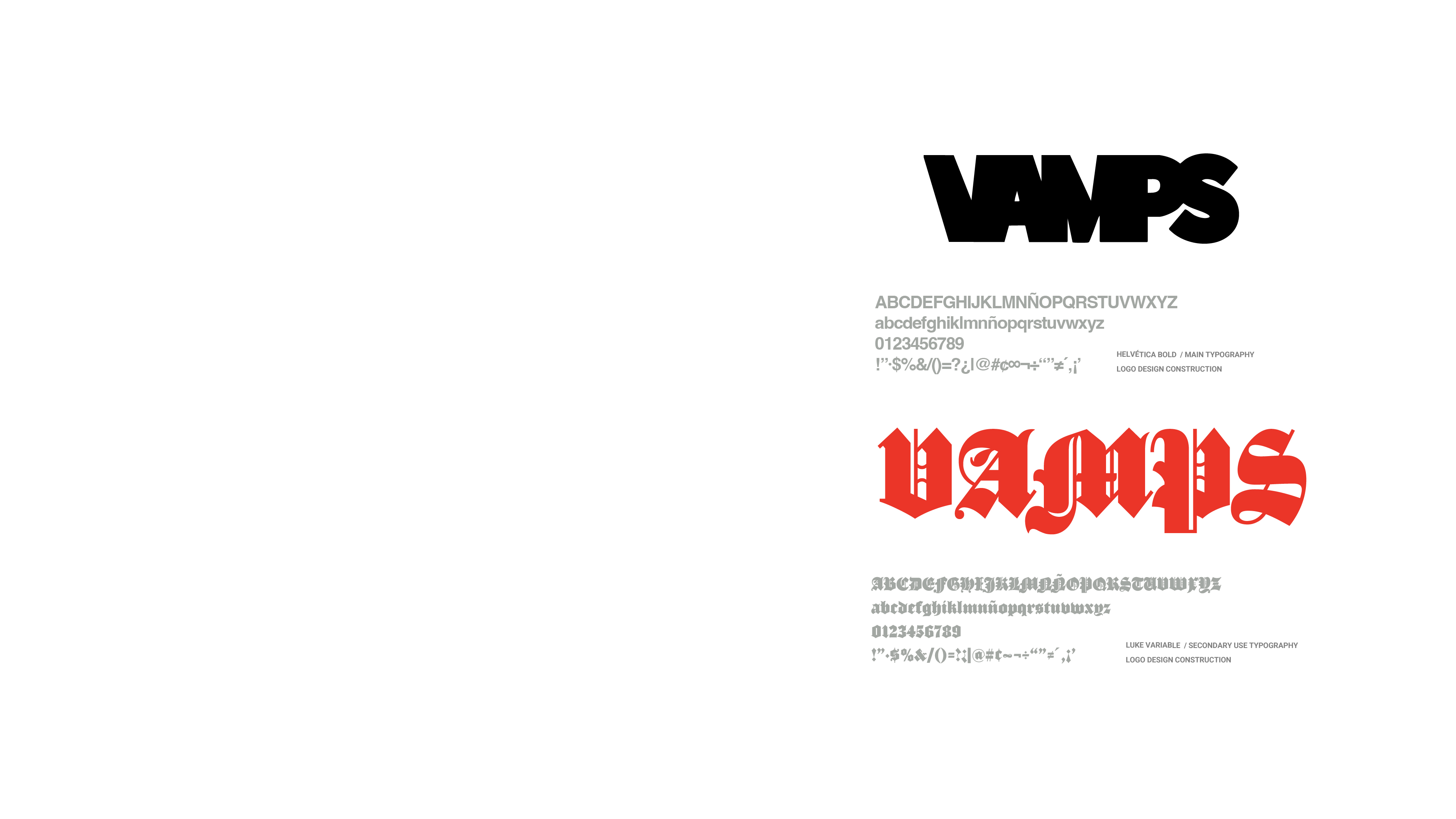
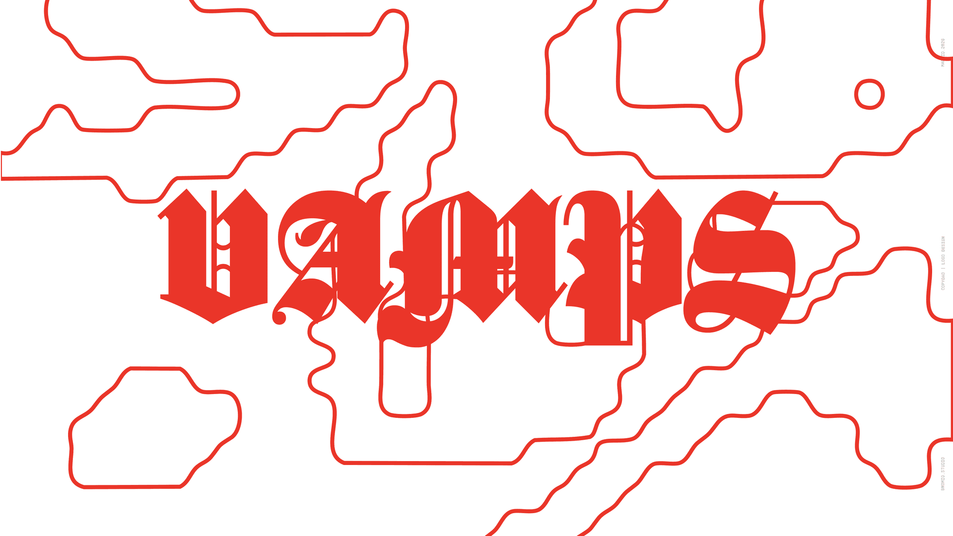
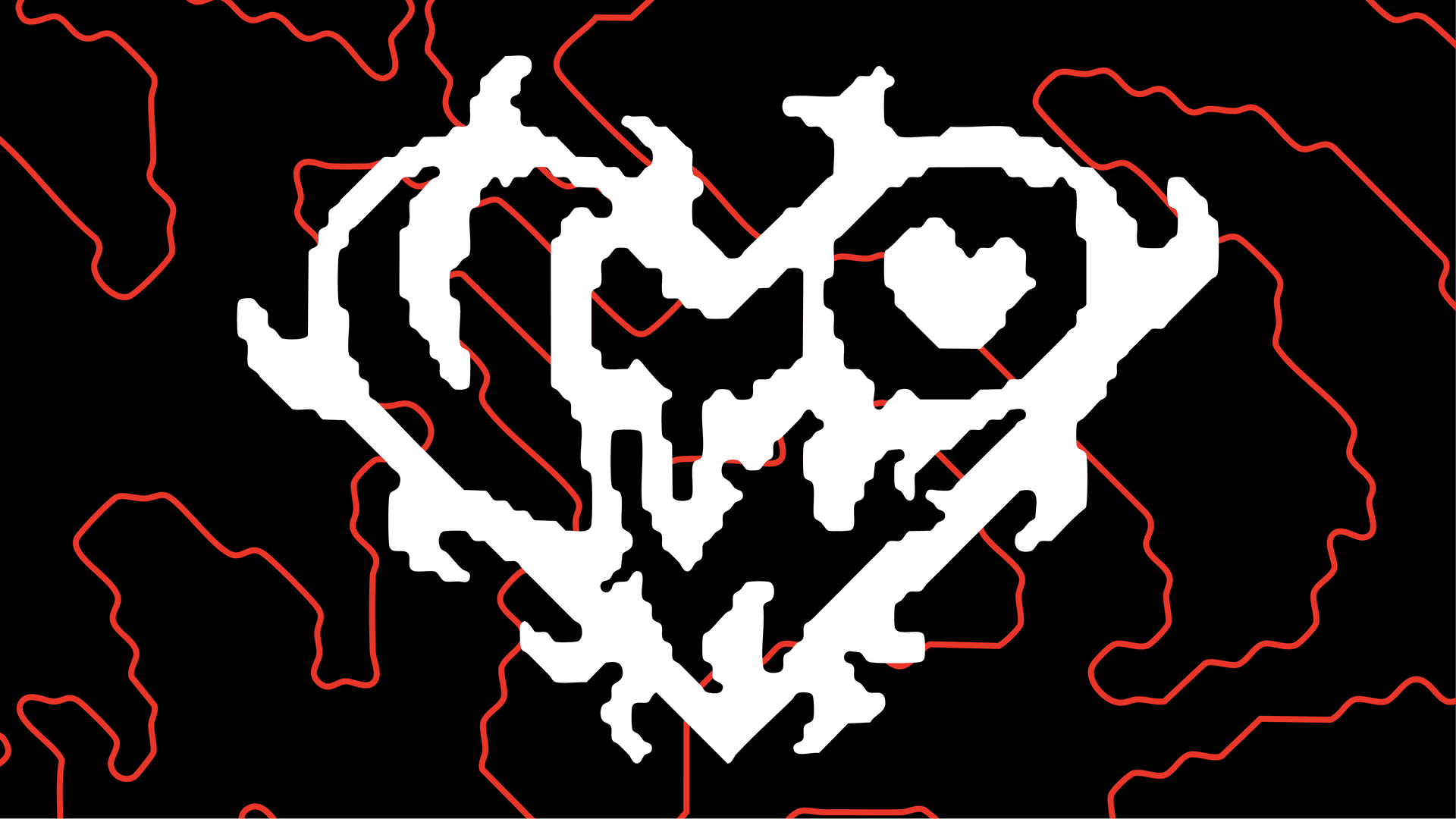
Creating a logo for VAMPS has been the hardest part of the project. I've tried to lock it into a style a thousand times and a thousand times I've gotten tired of it. I tried VampsCO, but while testing I exported an image that only read VAMPS — it was so blurred that I wanted to see what it'd look like vectorized. That's where the blurry pixel vector finish comes from. I deformed a Helvetica Bold to accentuate the negative spaces of the V and M, giving them a fang feel that connects with the eyes and ears, evoking a bat's face.
Crear un logo para VAMPS ha sido lo más difícil del proyecto. He intentado encapsularlo en un estilo mil veces y mil veces me he cansado. Probé con VampsCO, pero mientras hacía pruebas exporté mal una imagen que solo ponía VAMPS — al estar tan difusa, quise ver cómo quedaría si la llevase a vector. De ahí nace el acabado de blurry pixel vectorizado. Deformé una Helvética Bold para acentuar los espacios negativos de la V y la M, darles sensación de colmillo, que conecte con los ojos y las orejas, buscando la impresión de la cara de un murciélago.
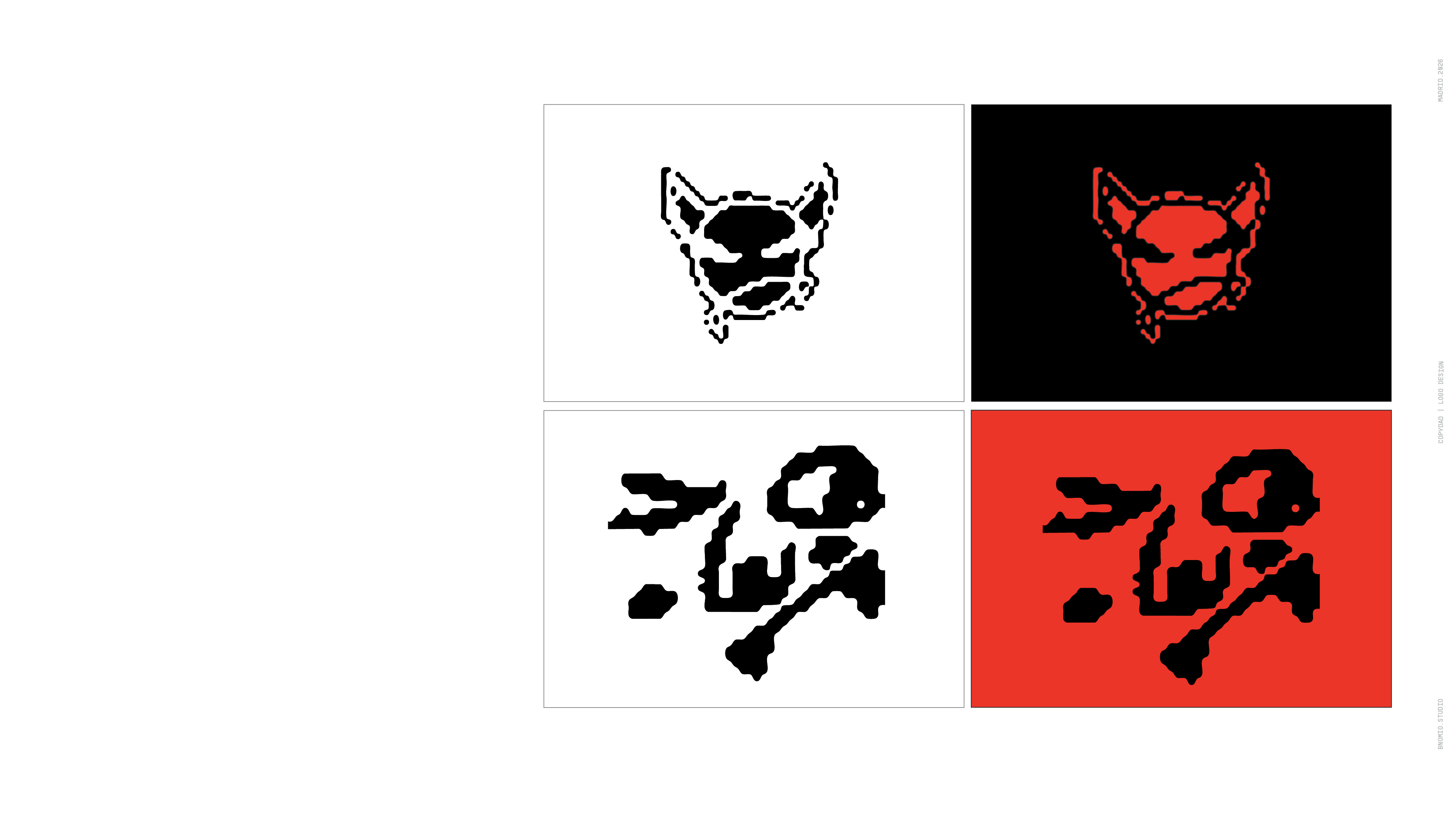
Proposing a single design for VAMPS is almost like trying to define myself through a single trait. From all the doodles, I chose two that work in their own space: the angry vampire and the playful one, each with their own thematic ground — one more rebellious, the other more friendly.
Plantear un solo diseño para VAMPS es casi como intentar definirme a través de una sola característica. De todos los garabatos, elegí dos que funcionan en su propio entorno: el vampiro enfadado y el vampiro juguetón, cada uno con sus espacios temáticos — uno más rebelde, el otro más amable.
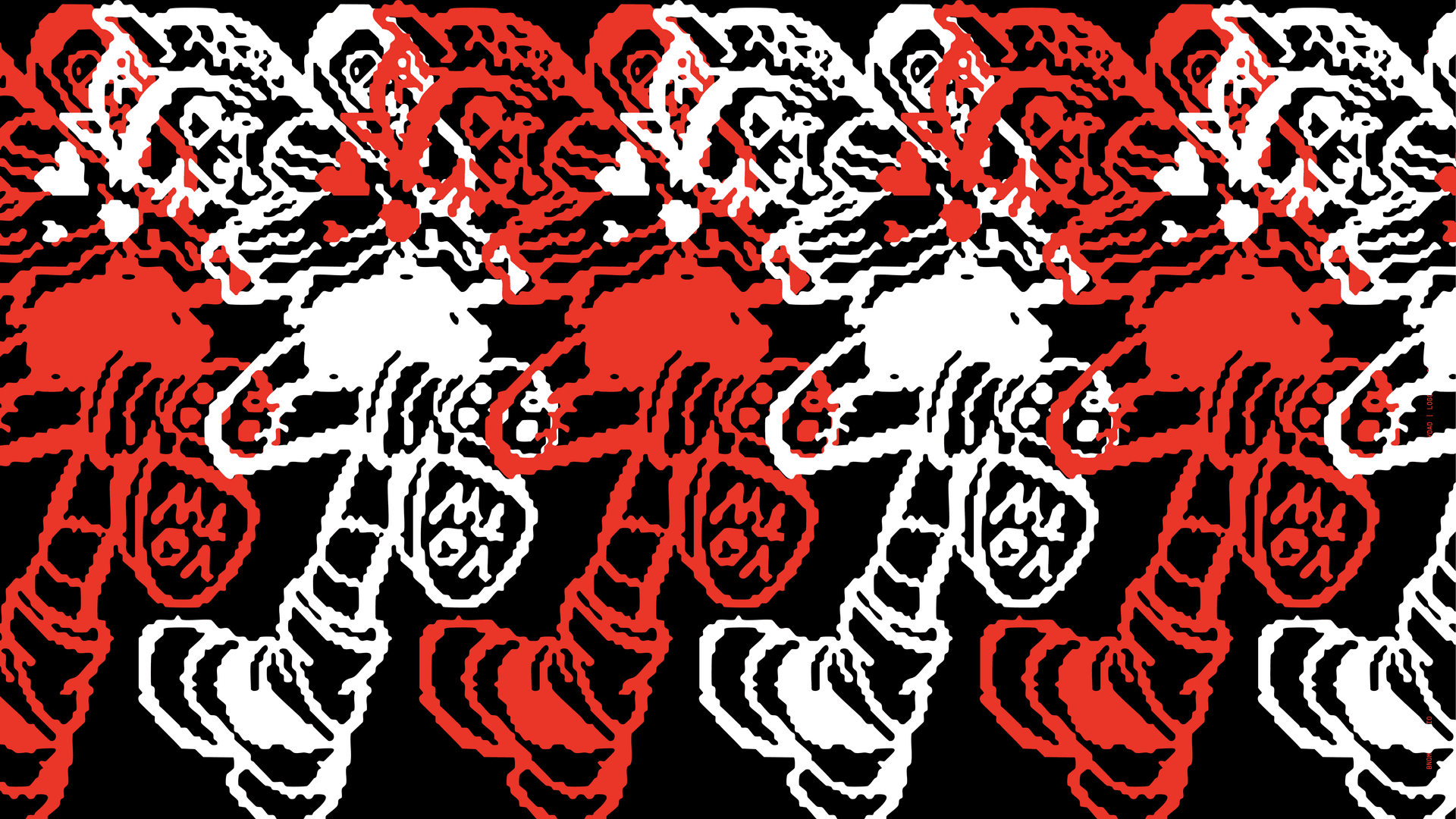
VAMPS comes from doodles, sketches, and tattoos — that's why black is the base color, the 'foundry color' that allows going from minimal to elaborate. The red isn't the obvious blood connection; we use it as a vibrant, aggressive counterpoint that sometimes borders on annoying. It lets us overload with energy and play in tandem with black and white. The blood thing is lazy and boring.
VAMPS nace del garabato, del sketch y del tatuaje — por eso el negro es el color base, el “foundry color” que permite ir de lo mínimo a lo elaborado. El rojo no es la conexión obvia con la sangre; lo usamos como contrapunto vibrante, agresivo, que a veces roza lo molesto. Nos permite sobrecargar de energía y jugar en tándem con el negro y el blanco. Lo de la sangre es vago y aburrido.
Vamps of
the world
The logotype is based on the pixelation and blur of a Helvetica Bold. For web and body text we use Helvetica or Roboto. As a secondary typeface, Luke Variable — a contemporary sans serif with balanced proportions and high legibility, whose variable weight axis allows flexible application across sizes and formats.
El logotipo se basa en el pixelado y desenfoque de una Helvética Bold. Para web y cuerpo de texto usamos Helvética o Roboto. Como secundaria, Luke Variable — una sans serif contemporánea con proporciones equilibradas y legibilidad alta, cuyo eje variable de peso permite aplicarla con flexibilidad en distintos tamaños y soportes.
School Day appeared following the natural arc of a design. I didn't develop it — a kid did, who thought it was fun to wear a t-shirt with a vampire he called 'the demon who goes to school.' That it accompanied a kid on his school day — I loved that. It's the kind of connection you rarely feel for an inanimate object. I hope VAMPS generates that more often. It's a good standard to aspire to.
School Day aparece siguiendo la línea natural de un diseño. No lo desarrollé yo, sino un niño al que le hacía gracia ponerse una camiseta con un vampiro y al que llamó “el demonio que va al cole”. Que acompañe a un niño en su día de cole me encantó — es el tipo de conexión que pocas veces se siente por un objeto inanimado. Ojalá VAMPS genere eso más a menudo. Es un buen estándar al que aspirar.
Hot, Fresh & Tasty — what does a pizza box have to do with a school day? Nothing, but the VAMPS pizza box does its own thing. I was looking at boxes for days and none had concept, so I went down to the pizzeria below, ordered two pizzas and two empty boxes. Black, white, and red sprays, jewelry — fang rings, black gem bracelets, tribal pendants — a methacrylate stencil and time to build the packaging. Basic tuff.
Hot, Fresh & Tasty — qué tiene que ver una caja de pizza con un día de cole? Nada, pero la pizza box de VAMPS va por su cuenta. Estuve mirando cajas durante días y ninguna tenía concepto, así que bajé a la pizzería de abajo, pedí dos pizzas y dos cajas vacías. Sprays negros, blancos y rojos, joyería — anillos de colmillos, pulseras con pedrería negra, colgantes tribales — un stencil de metacrilato y a montar el packaging. Basic tuff.